
Breakpoints
The NYS Design System uses five breakpoints to keep layouts consistent across devices, from small mobile screens to large desktop monitors. Each breakpoint sets a viewport range and a grid gutter size, so spacing scales as the screen grows.
The Breakpoint Scale
Gutters increase from 20px on mobile to 64px on desktop large.
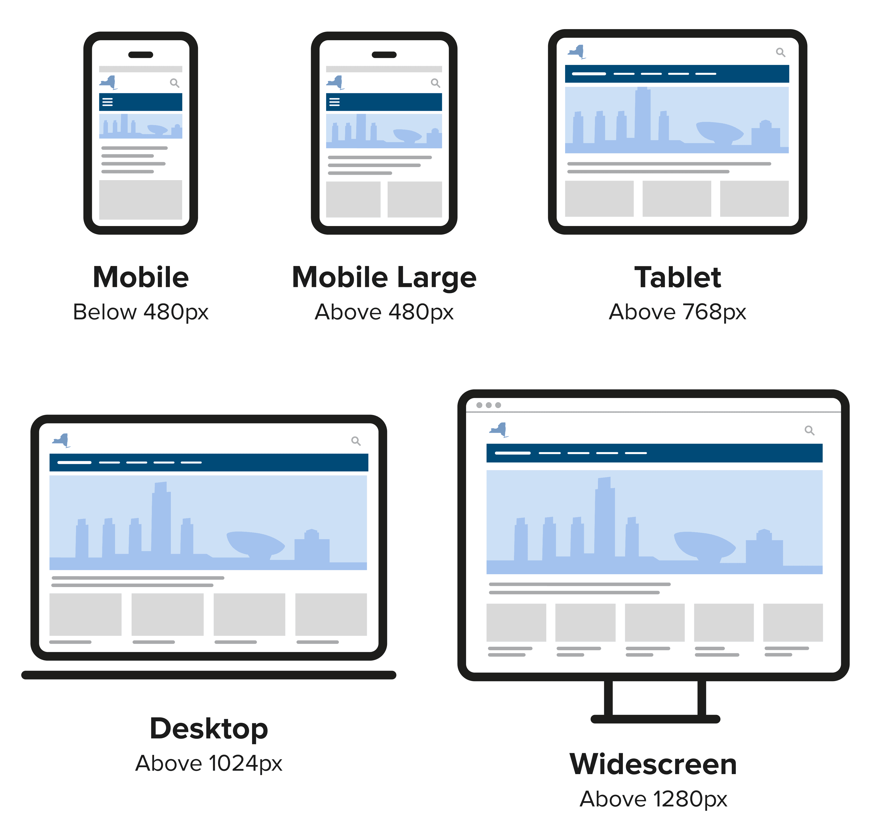
| Device | Width | Gutters |
|---|---|---|
| Mobile | 320-479px | 20px |
| Mobile Large | 480px-767px | 20px |
| Tablet | 768-1023px | 32px |
| Desktop | 1024-1279px | 32px |
| Widescreen | 1280-2500px | 64px |
Breakpoints & The Grid
Our grid system is built on the same breakpoints. Columns and gutters resize automatically as the viewport crosses each breakpoint, so teams don't need custom media queries for common layouts.
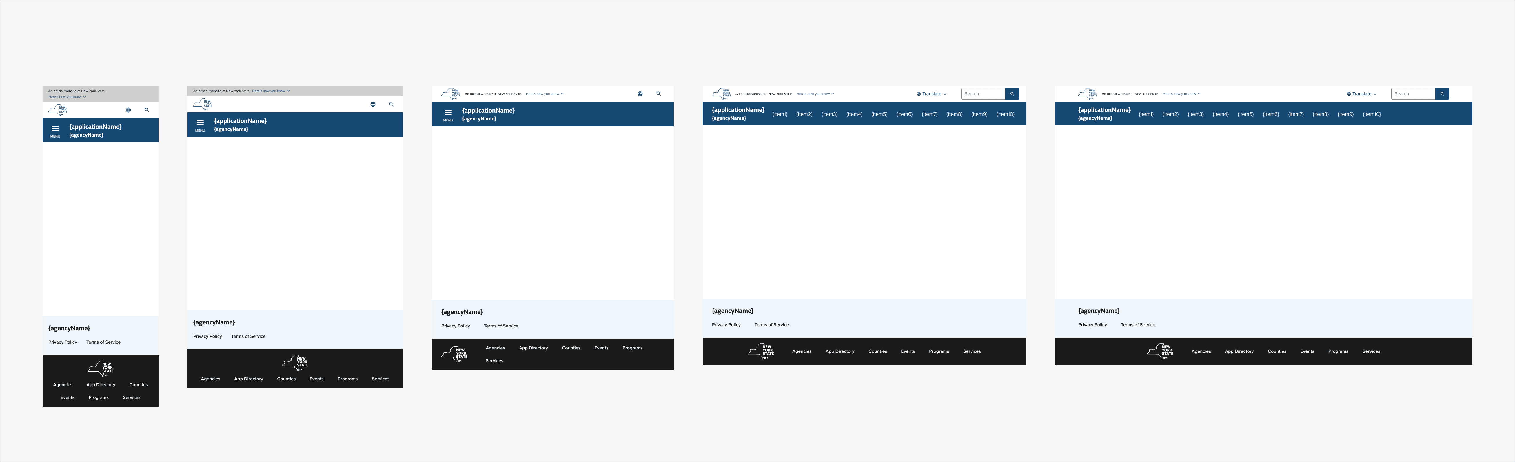
Page Templates
How the standard page layout looks at each breakpoint.
Edit this page on GitHub (Permissions required)
Last updated: October 5, 2026