
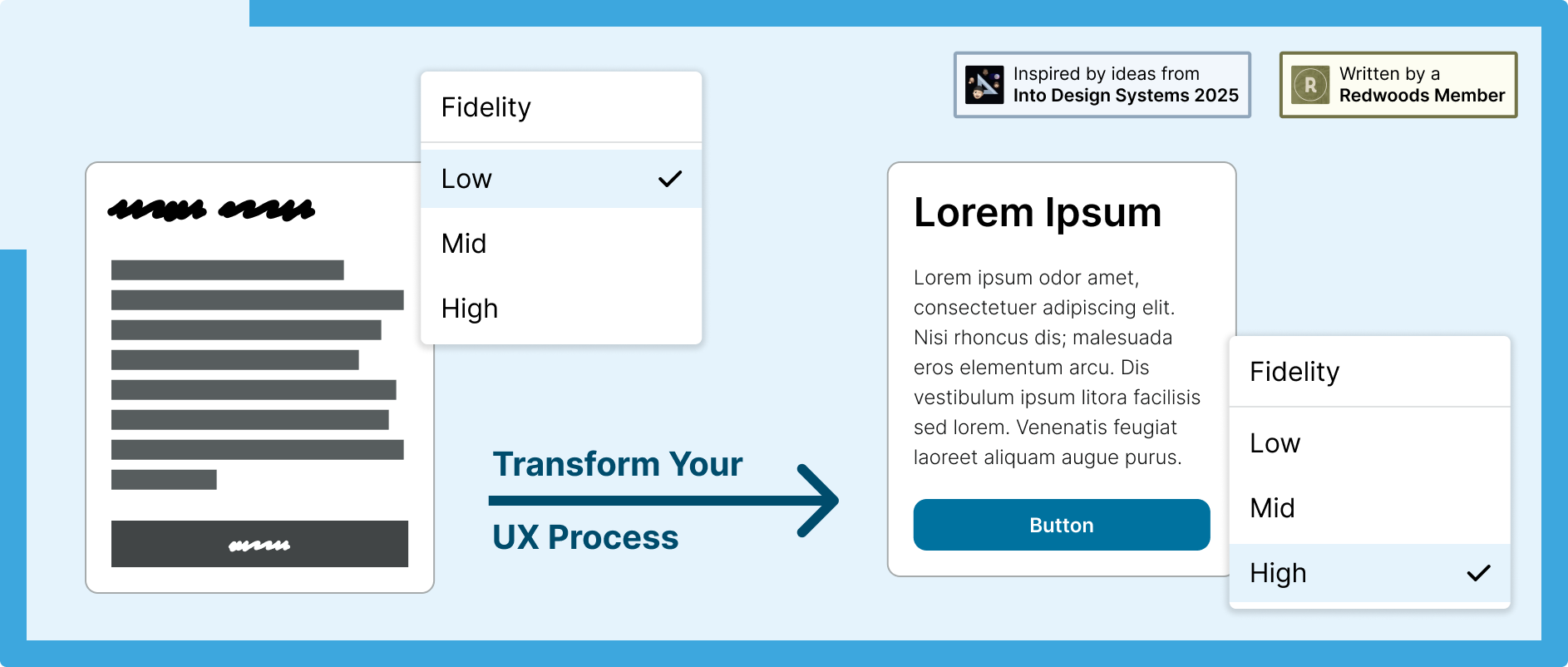
Rapid Wireframes to Prototypes with Fidelity Modes
Unlock new workflows by building your design system with a fidelity routing collection to swap between low-fi, mid-fi, and high-fi in one click.
Designing with speed and consistency doesn’t have to mean compromising on quality. In fact, with a smart, but simple, use of Figma’s variable collections and systems thinking, you can transform wireframes in FigJam into high-fidelity mockups and realistic prototypes in a single click.
Stakeholders, working under constrained budgets and timelines, are often hesitant to start with low fidelity because of the time (and associated cost) it takes to recreate screens in high fidelity. This friction often discourages early ideation and iteration.
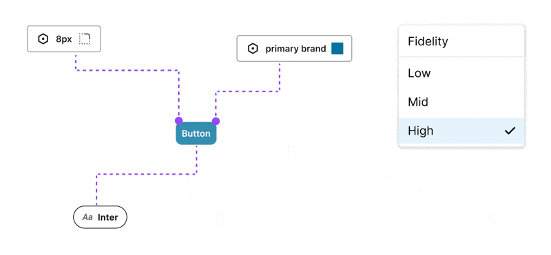
Components are built from Variables and Text Styles that change value depending on the Fidelity mode set.The approach described here removes that barrier by making the transition from low to high fidelity instantaneous. It enables teams to think through layout and content before discussing visual design. This not only reduces time and cost during the design process, but also removes the need for separate wireframing tools. It opens up new workflows — like designing in high or mid fidelity and instantly switching to low fidelity for clearer communication with stakeholders.
Some teams build separate wireframing libraries and use Figma’s library swap feature. The downside to this is that you need to maintain two separate libraries. By adopting this approach, teams who build their own custom components that don’t yet exist in the design system, as long as they are building with the design system’s published Figma Variables and Text Styles, will automatically have wireframing versions of their components that can be used in FigJam with the workaround explained below.
This article walks you through how I created a more streamlined UX workflow while working on the New York State Design System — and how you can apply these techniques to your own design system.
Note: this workflow is currently in a beta stage and has not yet been released in an officially supported capacity to users of the NYS design system.
The Power of Variable Collections in Figma
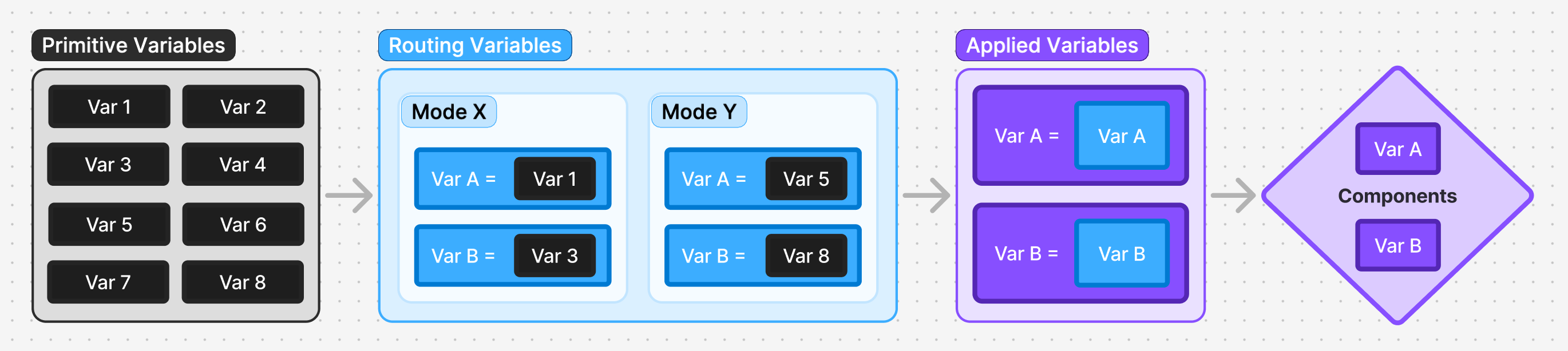
At the heart of this workflow are three types of Figma variable collections: Primitive, Routing, and Applied.
Primitive Variables
These are your foundational design tokens. They define raw values — like color ramps, font size ramps, spacing units — which serve as the base for your semantic variables.
Routing Variables
Sitting between primitives and applied variables, routing collections help manage different contextual modes such as:
- Branding: For multiple brand identities
- Fidelity: Low, Mid, and High design detail
- Device Size: Mobile, Tablet, Desktop
- Appearance: Light, Dark, High Contrast (Light/Dark)
Each mode adjusts which primitive variables are passed through, allowing flexibility without complexity.
Before we publish the NYS Design System to the Figma Community, I plan to add a new routing collection named ‘Organization’ with two modes: ‘State’ and ‘Local’. This would allow towns or counties in New York State to adopt our Figma Library and customize it by plugging in their own brand color ramps. By simply switching a screen into ‘Local’ mode, smaller orgs can instantly localize the design system without starting from scratch.
The idea for Routing collections came from the REWE design system’s talk at the Into Design Systems 2025 conference—credit to Vincent Schlothauer and Franziska Haaf for their innovative ideas. The conference recordings are a great resource if you’re interested in learning more advanced Figma Variable techniques.
Applied Variables
These are the variables that actually get applied to components and text styles. They carry no additional semantic meaning — just the final values that affect the visual interface. This abstraction enables you to add or adjust routing layers without disrupting the applied layer.
For further clarity: applied variables are mapped to a routing variable. The reason I’m taking this approach is if you apply the routing variables directly to components, then it is painful to add a new routing layer at the top as you’d then need to reapply all of your variables.
For example, look at the image below and imagine you applied the Fidelity routing layer to the components instead of the Applied variables. If you wanted to insert a routing layer above Fidelity you’d have to swap out all of the variables on your components (and any custom components created by users of the design system’s published variables and text styles). By following my approach you instead would simply map the Applied variables to the new routing layer variables.
Scoping and Publishing
Primitive and Routing collections should be configured to not be published and scoped to not apply to any Figma properties. By doing so, only Applied variables will show to consuming designers. All of the complexity of the routing collections is handled by the design system team. Users of the design system in Figma should only ever see, use, and think about the Applied variables.
Understanding the Fidelity Routing Collection
The Fidelity routing collection has three modes: High, Mid, and Low.
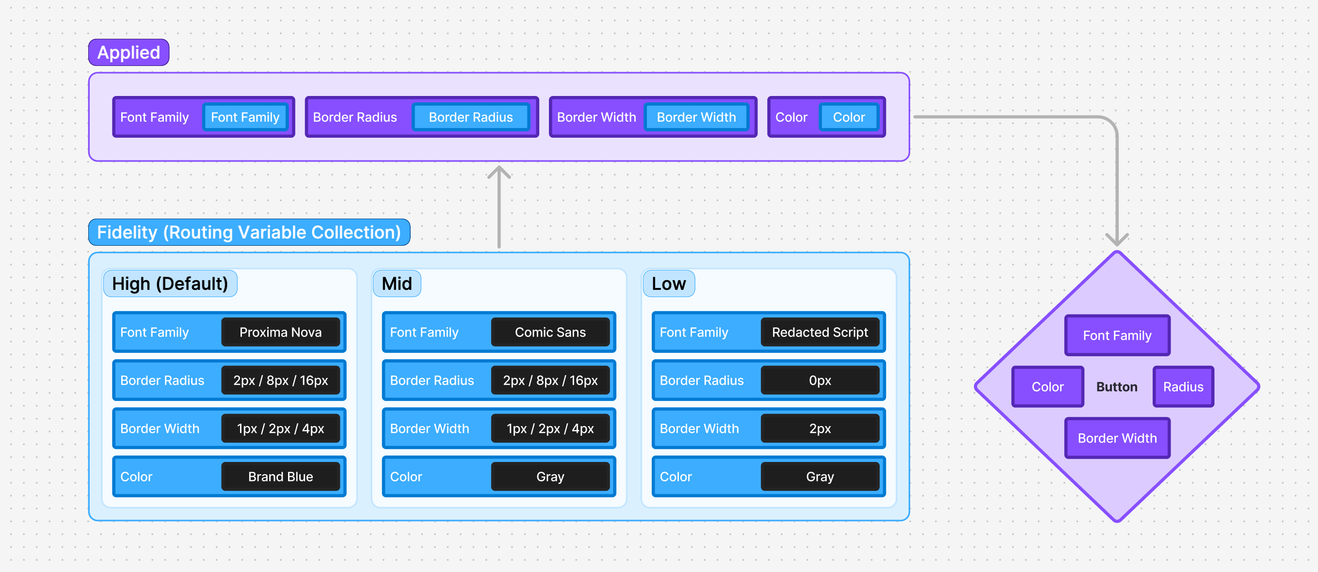
Variables are organized in the same structure in all routing collections with a parent group named to match the routing collection’s name so that it’s easier to identify which collection a given variable is being set to.
For example, in the Applied variable collection you might have a primary color variable of ‘primary’. So the variable collections might look like this for the first mode of each collection:
- Applied/Semantic:
color-primary(published) ←fidelity-color-primary - Fidelity: High:
fidelity-color-primary←brand-color-primary - Brand: Main:
brand-color-primary←state-blue-700 - Primitive:
state-blue-700←#154973
To manage variable collections efficiently, I use the Design System Organizer plugin. It was a huge help for tasks like swapping variables, duplicating variables between collections, and migrating variables between files — especially during the recent project I handled of merging our previously separate component and variable files.
One unexpected benefit: reviewing components in Low Fidelity mode has been a helpful litmus test. If two components look too similar when viewed in grayscale without a text label, it’s often a sign they need better differentiation.
FigJam Workaround with Fidelity Modes
You can’t currently set Figma Modes in FigJam so here’s a workaround for how you can start wireframing with this setup:
- Create a Section in Figma Design.
- Place a component with variables applied in the Section.
- Set the Section’s appearance to Low or Mid fidelity.
- Copy the Section into FigJam.
Now, any component placed within that section will automatically inherit the chosen fidelity style.
⚠️ Important Tip: Components placed in frames with a variable mode set are prolematic. I recommend using sections in FigJam for device artboards rather than a frame.
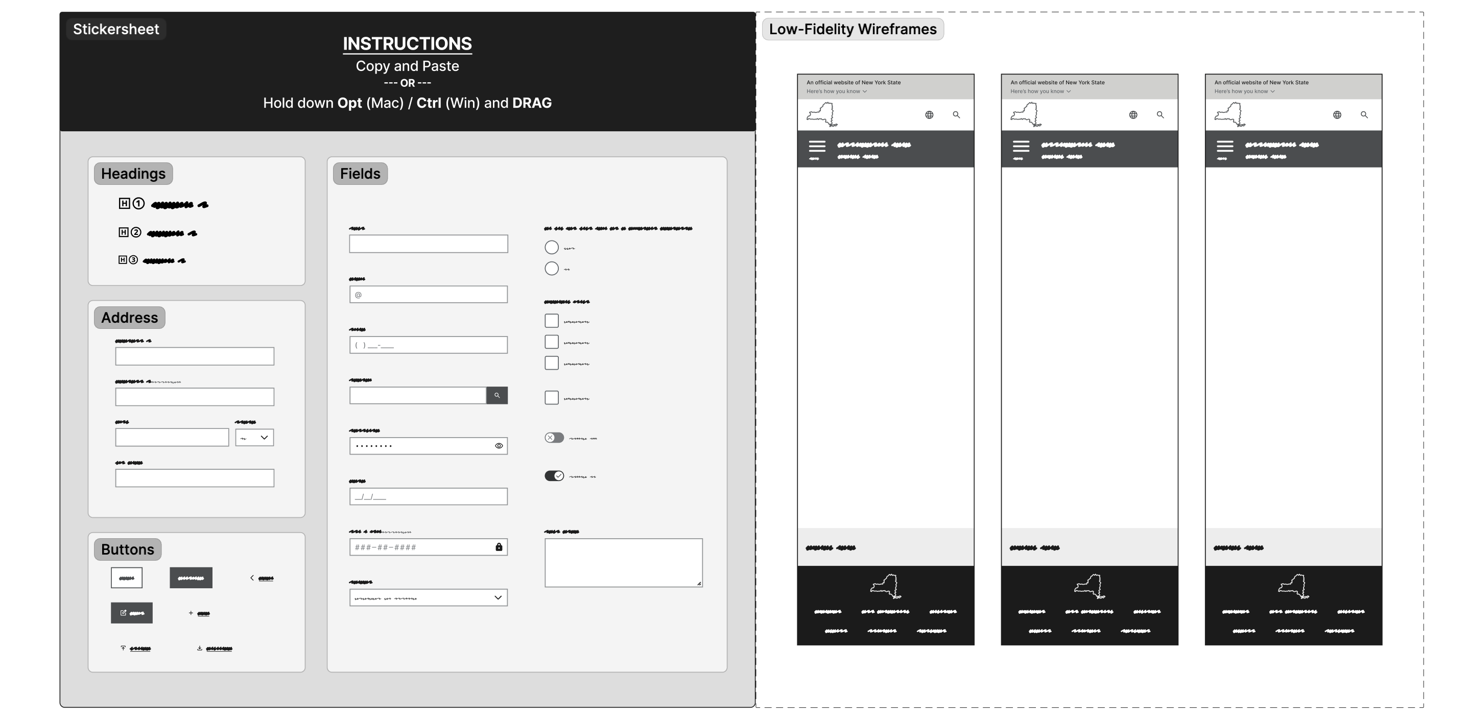
Building a Smart Wireframe Sticker Sheet
- Create components using applied variables that are defined by their equivalent values in a fidelity mode routing collection.
- Insert these components with different combinations of component properties into a section with a low or mid fidelity mode set.
- Use these components to wireframe directly in FigJam with your actual design system components making switching to Figma Design a simple copy and paste.
The Workflow in Action
This workflow replaces the need for separate wireframing tools — saving time and aligning designers and developers more closely.
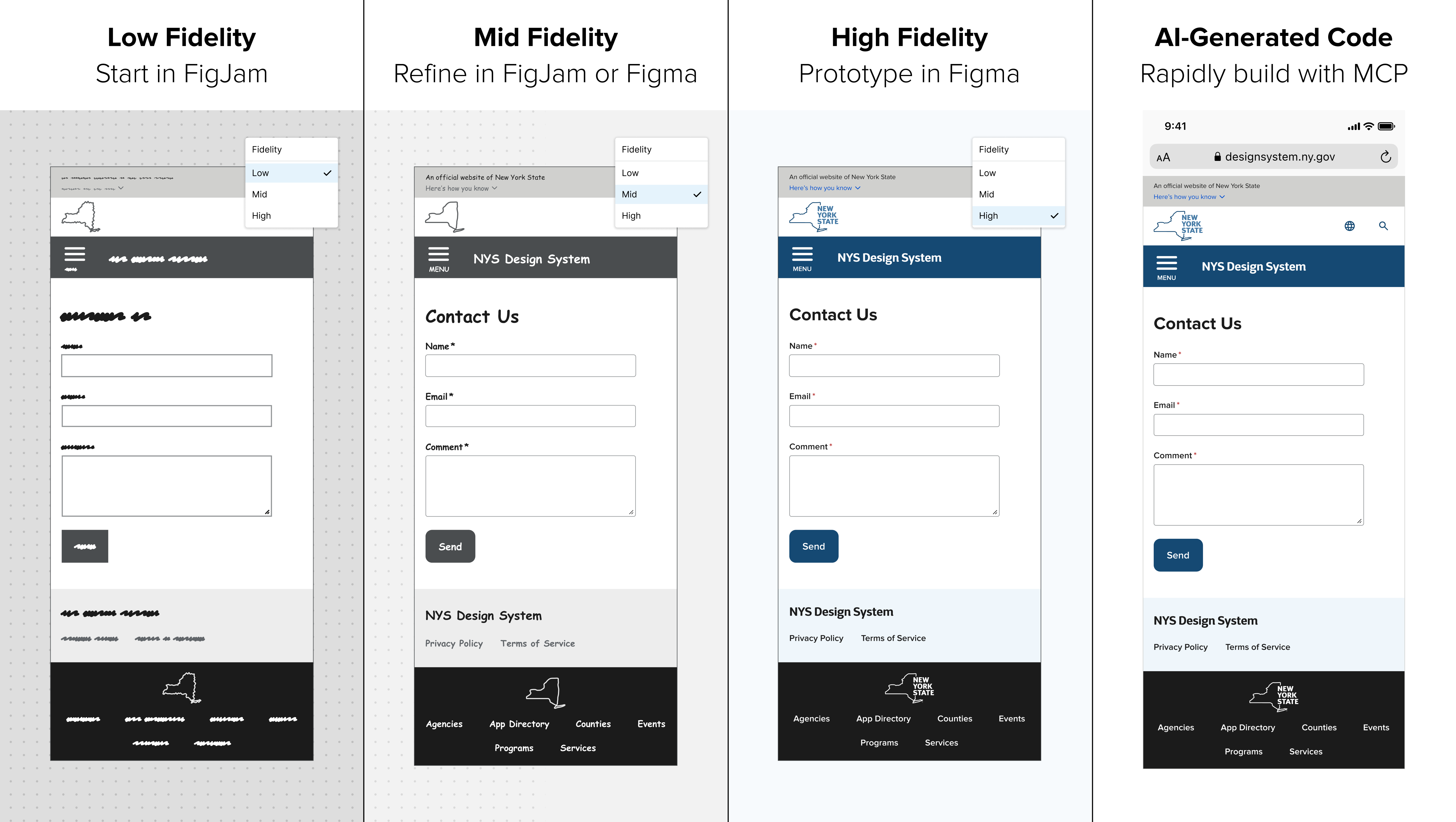
- Start in FigJam with Low Fidelity mode.
By starting in FigJam you force yourself not to think about component properties. FigJam is a simpler tool that lowers the barrier to entry for non-designers to contribute ideas. - Refine in FigJam or Figma in Mid Fidelity. Change fidelity mode to instantly switch to mid-fi to begin working on content without focusing on aesthetic appearance. Get feedback from stakeholders on layout, content, and copywriting.
- Switch to Figma to polish UI in High Fidelity mode. Refine colors, images, and component properties. Build prototypes and run usability testing. The components for the NYS Design System come with a lot of advanced, realistic prototyping built in already to make this fast and easy for designers.
- Rapidly transition to accurate code using Figma MCP Generate front-end code within seconds using MCP and Code Connect (see part two in this 2-part blog series for more on this topic).
Although we have Code Connect set up for all of our design system components, the variables and tokens aren’t yet automatically synced with code yet. We’re currently maintaining parity manually, which highlights the importance of strong naming conventions and documentation early on.
This approach may not be for everyone as it does require a robust collection of components and text styles built with Figma Variables. But for those who choose to adopt it, this will be transformational. To designers, this looks like a Figma magic trick because it feels like it shouldn’t be possible.
Bonus: Dynamic Component Variants by Fidelity
Applying a text variable to a component’s variant property on an instance allows you to swap designs by fidelity mode. For example, I’ve used this to switch the New York State logo, as seen above, between: Sketch (Low Fidelity), Outline (Mid Fidelity), and Full Vector (High Fidelity).
Thanks for reading! If this sparked any ideas, questions, or if you’ve experimented with your own routing collections please email the NYS Design System team at designsystem@its.ny.gov.
Let’s build better, together.
- article
- figma
- prototyping
- wireframes
- variables
- modes
Edit this page on GitHub (Permissions required)
Last updated: August 5, 2025