
How CSS Variables Power the NYS Design System
How the NYS Design System uses CSS variables and design tokens to enable consistent, scalable, and customizable UI development across New York State.
Consistency is one of the hardest problems in design. When dozens of teams and agencies each build their own products, even the most minor deviations, like different shades of red or slightly larger border radii, can fragment the user experience. We built the New York State Design System, in part, to solve these issues: to give teams a shared foundation that’s flexible enough for their needs, yet structured enough to remain consistent.
At the heart of that consistency are design tokens. Design tokens are not just an abstract concept, they are named design decisions that map to specific values and can be reused across platforms. In the NYS Design System, tokens are actual defined values that live in the @nysds/tokens package. One of their key strengths is that they are platform-agnostic: the same token definitions can be compiled down into different formats depending on the target platform, such as XML for Android or Swift for iOS. In our case, they are rendered into CSS custom properties (more commonly called CSS variables). These design tokens connect design intent and implementation, enabling the systematic definition, reuse, and override of values. In the NYS Design System, design tokens are created at a primitive level that then map to a semantic level above that. Then in the components themselves, these design tokens are applied to CSS custom properties (more commonly called variables) that have the same syntax structure of the tokens themselves.
Let’s unpack how that works.
What Are CSS Variables?
A CSS variable works like a variable in any programming language; it holds a value that is then used throughout the stylesheet. Instead of writing the same hex code or pixel value repeatedly, you assign it once and reference it with a name.
:root {
  --nys-component-background-color: #154973;
}
Then, anywhere you need that color:
.nys-component {
  background-color: var(--nys-component-background-color);
}
Change the value once, and every element that uses it updates automatically. That’s the power of variables: one definition, infinite reuse. But CSS variables in our design system go beyond convenience: they establish a language for consistency and scalability.
Primitive Tokens — The Foundation
Primitive tokens are the building blocks of the design system. They are the raw values (hex codes, spacing units, font sizes, border radii) that everything else references.
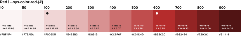
For example, our color system is organized in ramps. Each color family has a scale, from light to dark, where smaller values represent a soft tint, while larger values represent a deep, saturated tone. This predictable pattern lets designers and developers discuss color consistently, and in a structured way. The same logic applies to spacing, typography, and radius.
--nys-color-red-10
--nys-color-red-50
--nys-color-red-100
--nys-color-red-200
...
--nys-color-red-900
These primitives are stable. Their names never change, even if the underlying values are updated over time. --nys-color-red-100 might shift to meet new accessibility or brand needs, but the token itself will always exist as a constant in the system.
Semantic Tokens — Meaning and Context
On top of primitives are semantic tokens, which describe intent rather than raw value. This distinction matters: semantic tokens make it clear what to use where. Rather than leaving developers to guess whether to reach for --nys-color-red-600 or -nys-color-red-500, semantic tokens communicate purpose directly in their name. Primitive tokens should only ever be referenced when mapping them to a semantic token. When codebases skip this layer and reference primitives directly, changes become painful: a single rebrand or accessibility adjustment means hunting down every raw value instead of updating one token.
Instead of referencing --nys-color-red-600, we use:
--nys-color-danger: var(--nys-color-red-600);The semantic term "danger," communicates the intent conveyed by the color it maps to. It tells anyone reading the code that "this color indicates an error or destructive action."
If an agency decides their "danger" color shouldn’t be as intense, they can override just one variable:
--nys-color-danger: var(--nys-color-red-400);Every instance of "danger" across their application is automatically updated. They don’t need to hunt through dozens of components or CSS files.
Semantic tokens abstract meaning from implementation, making the design system adaptable to different contexts (like accessibility needs or branding variations) without compromising structure.
Public vs. Private Tokens
Not every variable is intended for direct use or override. To keep things predictable, we use an underscore convention to distinguish between internal and public-facing tokens:
--_nys-button-background-color: internal (used inside the component)--nys-button-background-color: public (documented and safe to override)
CSS doesn’t support private variables, so this convention helps our team organize and maintain the system. From a user perspective, you don’t need to worry about which is which—if a variable is safe to override, it will appear on the component’s documentation page under CSS Variables. Please note that most components will NOT have overridable variables, these public variables are rare and created intentionally to ensure a cohesive design system.
Internally, private tokens often map to their semantic or primitive version. Let’s look at the background color of nys-button and follow its token map:
--_nys-button-background-color: var(--nys-button-background-color, var(--nys-color-theme));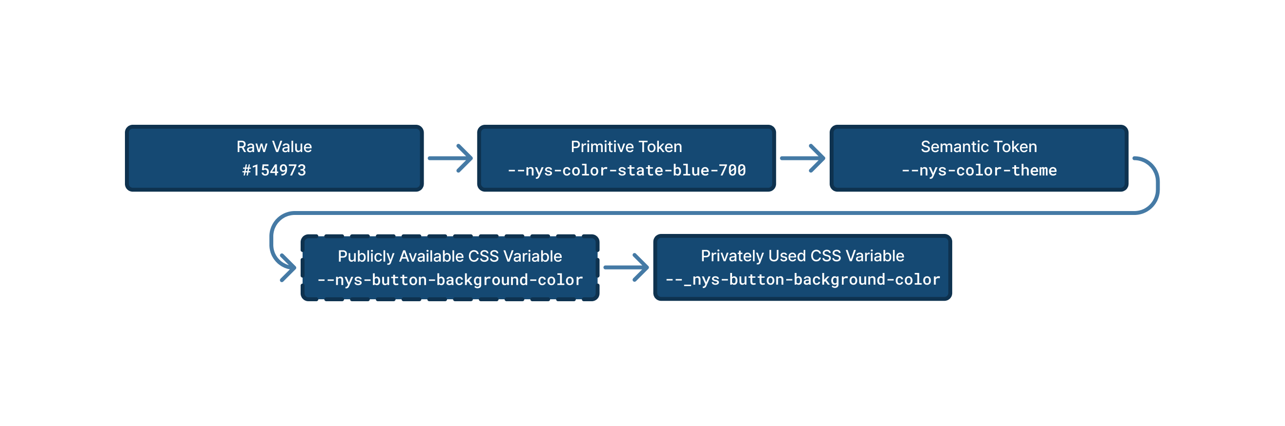
This means:
- If a public override exists, use it.
- If not, fall back to the default color, in this scenario
--nys-color-theme.
That layering ensures reliability even when variables aren’t explicitly defined.
Override Hierarchy and Theming
One of the most significant advantages of this token structure is theming.
Agency groupings under the NYS umbrella often have distinct brand colors: Environmental uses green, Admin uses orange, Safety uses gray. Instead of rewriting styles, they simply override semantic tokens through the data-theme attribute. So while the default --nys-color-theme is set to var(--nys-color-nys-blue-600), by setting data-theme="admin" at the top most level of the project, --nys-color-theme will instead map to var(--nys-color-admin-orange-700).
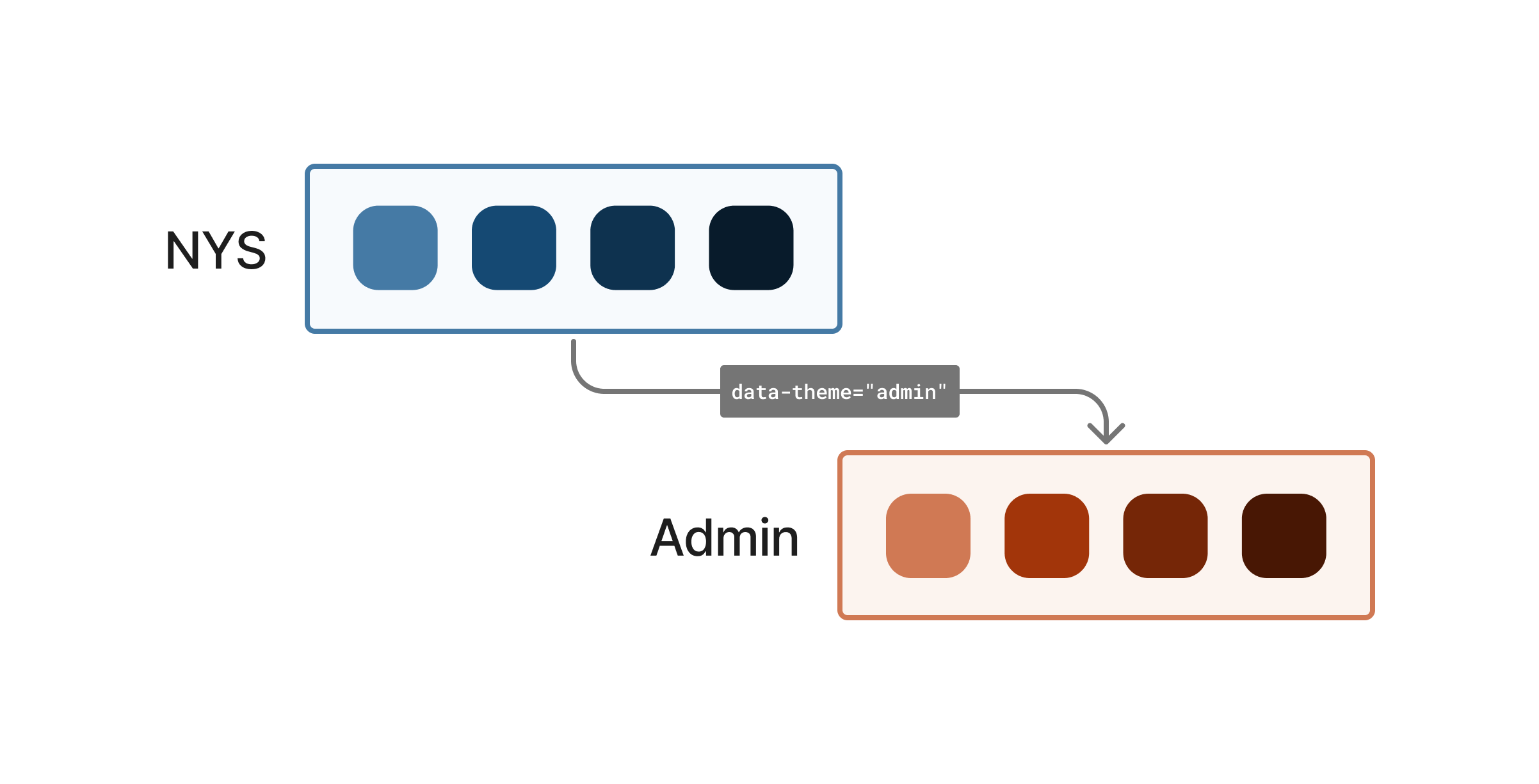
All components referencing --nys-color-theme automatically adapt to use the proper color ramp of the set theme.
This design makes the New York State Design System scalable across diverse agencies while maintaining visual unity and predictable behavior.
When (and Why) Overrides Inform the System
When multiple teams consistently override the same token in the same way, it suggests a gap in the system.
For example, if several agencies keep overriding the --nys-button-background-color to the agency’s accent color, that’s valuable data. It tells us that an "accent" button might deserve to become an official variant. If you find your team doing this often, consider helping us (and ultimately you) by submitting a component proposal
suggesting a new variant or enhancement.
In other words, overrides help the system evolve organically, guided by real-world use rather than guesswork.
Balancing Flexibility and Control
Design systems often struggle between two extremes:
- Too rigid: teams can’t adapt the components to their needs.
- Too loose: every team customizes everything, and consistency collapses.
CSS variables offer a middle ground. They allow overrides for legitimate edge cases without introducing dozens of one-off variants.
By creating public-facing CSS variables we are not encouraging teams to stray from the provided variants of our existing components, but, instead, we are providing a safe way for them to diverge in these edge-case scenarios where the existing options are not possible to implement.
Naming Conventions and Readability
One final principle: readability beats cleverness.
Every variable name in our design system maps directly to its CSS property name. For instance, the text color of a button maps to --_nys-button-color rather than to --_nys-button-text-color.
This one-to-one mapping reduces cognitive load for engineers. No need to remember abbreviations or shorthand. You can look at the variable and instantly know which property it controls.
Modifiers (--hover, --active, etc.) extend that clarity to states.
Note: If you override --nys-button-background-color, remember to override the hover and active variants too. Otherwise, your hover state will revert to the default.
Why This Matters
CSS variables are the key to making our web components scalable, flexible, and maintainable. Because the CSS variables used the shared vocabulary of the design tokens across the ecosystem, color, spacing, and typography mean the same thing in every product.
They allow:
- Designers to define intent once and apply it everywhere.
- Developers to override safely within a structured system.
- Agencies to customize branding without rewriting components.
- The NYS Design System team to evolve the design language based on actual usage.
This shared language is what turns our collection of components into a true design system.
- article
- css variables
- design tokens
- theme switching
- design system
Edit this page on GitHub (Permissions required)
Last updated: April 21, 2026