
Card
The <nys-card> component is a flexible container that groups related content and actions about a single subject, such as a program, an event, or a news item.
Text content is supplied through the preheading, heading, subheading, and description properties. For richer content, use the preheading, default, and footer slots to project custom markup such as badges, lists, buttons, or links. Images go in the media slot.
A card fills the width of its container, so place it inside a grid column to control its size.
<div class="nys-tablet:nys-grid-col-6">
  <nys-card
    heading="Heading"
    description="A short description of the card's subject."
  ></nys-card>
</div>
Can't use NYS Design System web components in your project? Try using the CSS Variables instead.
Accessibility
The <nys-card> component includes the following accessibility-focused features:
- The
headingrenders as a real heading element, so the card appears in the page's heading outline and can be reached with screen reader heading navigation. headingLevelsets that element toh1throughh6, so cards fit the surrounding hierarchy rather than forcing a fixed level. It defaults toh2.- A card with
hrefrenders as a real<a>, and a card with a click handler renders as a real<button>, so it is focusable, activates from the keyboard, and is announced with the correct role. - Using
onClickinstead of binding your own@clickkeeps keyboard activation working. A click listener on a plain container is mouse-only. - An interactive card takes its accessible name from its text content, so give it a
headingthat describes where it goes or what it does. - A card without
hrefor a click handler is a container, not a control. Anything interactive is a real button or link placed in a slot, and each stays individually focusable and keeps its position in the tab order. - Slotted content stays in the light DOM, so its own semantics and accessible names are preserved.
- Text uses design system typography tokens and scales with browser zoom and user font-size settings.
Keep the following in mind when using card media:
-
You supply the
<img>in themediaslot, so you control its alternative text. Card media is decorative in this pattern: mark itrole="presentation"and never place information only in the image. -
The
media-accentslot renders its content visually over the media. Repeat the full date in theheading,subheading, ordescriptionso it is available to everyone.Additional accessibility test and build content is coming soon, in a new format.
Options
Preheading
Use preheading to add a short label above the heading, such as a category or content type.
<div class="nys-tablet:nys-grid-col-6">
  <nys-card
    preheading="Preheading"
    heading="Heading"
    description="A short description of the card's subject."
  ></nys-card>
</div>
Subheading
Use subheading to add supporting text directly below the heading.
<div class="nys-tablet:nys-grid-col-6">
  <nys-card
    heading="Heading"
    subheading="Subheading"
    description="A short description of the card's subject."
  ></nys-card>
</div>
Heading Level
The card heading renders as a real heading element. It defaults to h2. Use headingLevel to set it to h1 through h6 so the card fits the page's heading hierarchy.
<div class="nys-tablet:nys-grid-col-6">
  <nys-card
    heading="Heading"
    headingLevel="h3"
    description="Set the heading level to fit the page's heading hierarchy."
  ></nys-card>
</div>
Description
Use description for the card's body text. It takes plain text only. When the body needs rich text or more content, use the default slot instead.
<div class="nys-tablet:nys-grid-col-6">
  <nys-card
    heading="Heading"
    description="A short description of the card's subject."
  ></nys-card>
</div>
Media Slot
Use the media slot to add an image to the top of the card. Pass a standard <img> element, so you control the source, loading behavior, and alternative text.
Card media is presentational, so mark it with role="presentation" and keep any information the user needs in the card's text.

<div class="nys-tablet:nys-grid-col-6">
  <nys-card
    heading="Heading"
    description="A card with a media image."
  >
    <img
      slot="media"
      src="/assets/img/components/card-media/minnewaska-card-media.jpg"
      role="presentation"
    />
  </nys-card>
</div>
Inset Media
Set inset to add padding around the media so it sits visually inside the card rather than running to its edges.
<div class="nys-tablet:nys-grid-col-6">
  <nys-card
    heading="Heading"
    description="Inset adds padding around the media to visually contain it."
    inset
  >
    <img
      slot="media"
      src="/assets/img/components/card-media/minnewaska-card-media.jpg"
      role="presentation"
    />
  </nys-card>
</div>
Media Accent Slot
Use the media-accent slot to display a badge over the media, typically a date. Pass a wrapper holding two elements: the first renders as the month line, the second as the day line. The accent only renders when the media slot has content.
Because the accent sits in the image area, repeat the full date in the card's text for anyone who needs it in context.
<div class="nys-tablet:nys-grid-col-6">
  <nys-card
    heading="Heading"
    description="A card with a media image and a date accent."
  >
    <img
      slot="media"
      src="/assets/img/components/card-media/minnewaska-card-media.jpg"
      role="presentation"
    />
    <div slot="media-accent">
      <span>Oct</span>
      <span>16</span>
    </div>
  </nys-card>
</div>
The media-accent slot can be combined with inset.
<div class="nys-tablet:nys-grid-col-6">
  <nys-card
    heading="Heading"
    description="A card with a media image and a date accent."
    inset
  >
    <img
      slot="media"
      src="/assets/img/components/card-media/minnewaska-card-media.jpg"
      role="presentation"
    />
    <div slot="media-accent">
      <span>Oct</span>
      <span>16</span>
    </div>
  </nys-card>
</div>
Elevated
Set elevated to add a drop shadow, giving the card a raised appearance. Use it to lift a card off a tinted background, not to rank cards against one another.
<div class="nys-tablet:nys-grid-col-6">
  <nys-card
    heading="Heading"
    description="Elevated adds a drop shadow to give the card a raised appearance."
    elevated
  ></nys-card>
</div>
Link Card
Set href to make the whole card a single link. The card renders as one <a>, so the entire surface is the target. Use target to control where the link opens.
Signal that the card is interactive by putting an icon in the footer slot.
The whole card is one link. To visually indicate this you should add the open_in_new icon to the footer slot
<div class="nys-tablet:nys-grid-col-6">
  <nys-card
    href="https://www.ny.gov/"
    target="_blank"
    heading="Visit NY.gov"
  >
    <p>The whole card is one link. To visually indicate this you should add the <code>open_in_new</code> icon to the footer slot</p>
    <nys-icon slot="footer" name="open_in_new" size="5xl" style="justify-content: end;"></nys-icon>
  </nys-card>
</div>
Clickable Card
Give the card a click handler to make the whole card a single <button>. Use the onClick property (or an inline onclick) rather than binding @click yourself, so the card stays keyboard accessible.
The whole card is one button. To visually indicate this you should add the arrow_forward icon to the footer slot.
<div class="nys-tablet:nys-grid-col-6">
  <nys-card
    onclick="alert('you clicked me')"
    heading="Heading"
  >
    <p>The whole card is one button. To visually indicate this you should add the <code>arrow_forward</code> icon to the footer slot.</p>
    <nys-icon slot="footer" name="arrow_forward" size="5xl"></nys-icon>
  </nys-card>
</div>
An interactive card is one control, so keep its slots free of buttons, links, and other interactive elements. Nesting them inside the card control is invalid HTML and leaves them unreachable for keyboard and screen reader users.
Preheading Slot
Use the preheading slot for content above the heading block, such as a badge or status label.
<div class="nys-tablet:nys-grid-col-6">
  <nys-card
    heading="Heading"
    description="A card with content in the preheading slot."
  >
    <nys-badge slot="preheading" label="New" intent="success"></nys-badge>
  </nys-card>
</div>
Default Slot
Use the default slot for the card's main body when description is not enough, such as rich text or another component.
<div class="nys-tablet:nys-grid-col-6">
  <nys-card heading="What's included">
    <nys-iconlist divider>
      <nys-iconlistitem icon="check">First item</nys-iconlistitem>
      <nys-iconlistitem icon="check">Second item</nys-iconlistitem>
      <nys-iconlistitem icon="check">Third item</nys-iconlistitem>
    </nys-iconlist>
  </nys-card>
</div>
Footer Slot
Use the footer slot for actions at the bottom of the card, such as a button or link.
<div class="nys-tablet:nys-grid-col-6">
  <nys-card heading="Heading" description="A card with actions in the footer slot.">
    <nys-button slot="footer" label="Learn more" href="https://www.ny.gov"></nys-button>
  </nys-card>
</div>
Card Grid
A card fills the width of its container. To lay out several cards, place each one in a grid column.
By default a card is only as tall as its content, so cards in the same row can end up uneven. Set --nys-card-height: 100% to stretch each card to the height of its column. The extra height is absorbed by the main content area, which keeps the footer slot pinned to the bottom of every card. The column also has to give the card a height to fill, so add nys-display-flex to it.
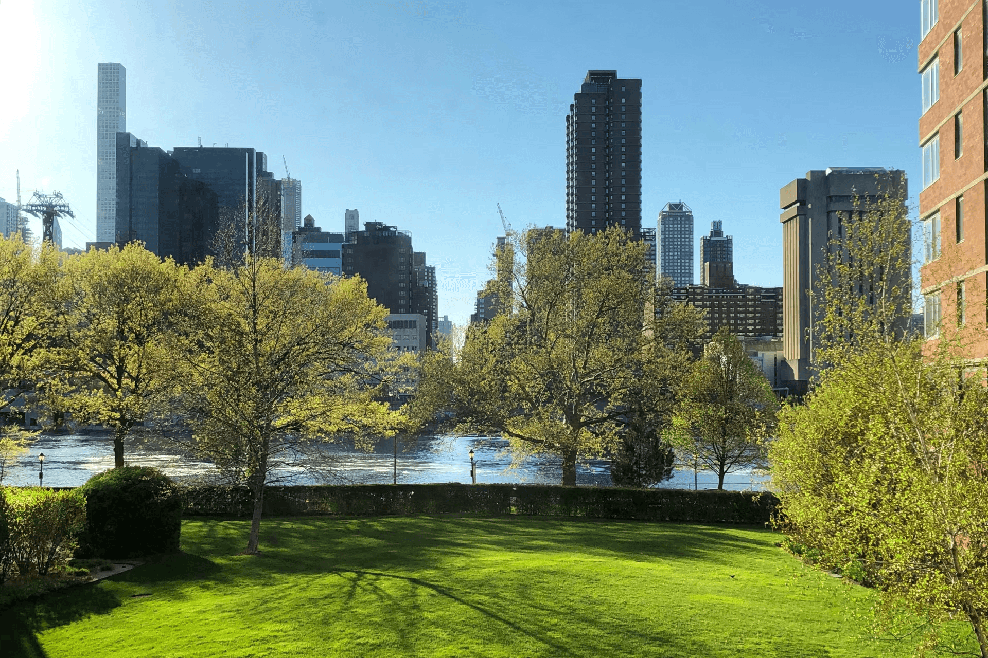
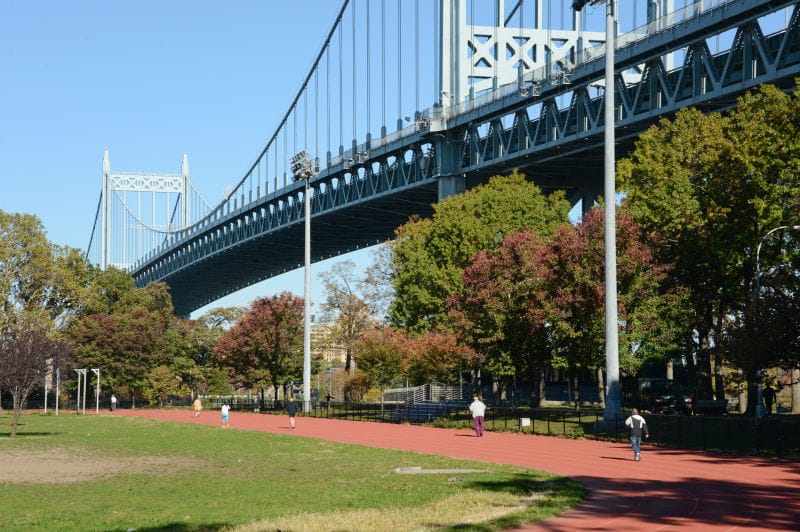

<div class="nys-grid-row nys-grid-gap" style="--nys-card-height: 100%">
  <div class="nys-mobile-lg:nys-grid-col-6 nys-tablet:nys-grid-col-4 nys-display-flex">
    <nys-card
      heading="Roosevelt Island Four Freedoms State Park"
      description="A memorial park on Roosevelt Island dedicated to Franklin D. Roosevelt, featuring sweeping lawns, formal gardens, and panoramic views of the Manhattan and Queens waterfronts on all sides."
    >
      <img slot="media" src="/assets/img/components/card-media/manhattan-card-media.png" role="presentation" />
      <nys-button slot="footer" label="Visit Manhattan" fullWidth></nys-button>
    </nys-card>
  </div>
  <div class="nys-mobile-lg:nys-grid-col-6 nys-tablet:nys-grid-col-4 nys-display-flex">
    <nys-card heading="Astoria Park" description="A waterfront park.">
      <img slot="media" src="/assets/img/components/card-media/astoria-card-media.jpg" role="presentation" />
      <nys-button slot="footer" label="Visit Queens" fullWidth></nys-button>
    </nys-card>
  </div>
  <div class="nys-mobile-lg:nys-grid-col-6 nys-tablet:nys-grid-col-4 nys-display-flex">
    <nys-card heading="Brooklyn Bridge Park" description="A park.">
      <img slot="media" src="/assets/img/components/card-media/brooklyn-card-media.png" role="presentation" />
      <nys-button slot="footer" label="Visit Brooklyn" fullWidth></nys-button>
    </nys-card>
  </div>
</div>
Usage
- Use a card to group content and actions about a single subject, such as one program, event, or news item.
- Set
headingLevelso the card heading fits the surrounding page hierarchy. - Keep headings short and specific, so a card is understandable on its own.
- Put actions in the
footerslot as real buttons or links. - Use
hreforonClickwhen the whole card leads to one destination or performs one action, and add an icon to thefooterslot so the interaction is visible. - Keep cards in the same group consistent in structure, so they are easy to scan and compare.
- Repeat any information shown in the media or the
media-accentslot in the card's text. - Place each card in a grid column to control its width, and set
--nys-card-height: 100%when a row of cards should share one height.
- Use a card as a substitute for a page section heading or for content that belongs in the page flow.
- Put buttons, links, or other interactive elements in the slots of a card that has
hrefor a click handler. That card is already a single control. - Set both
hrefand a click handler on the same card. - Put more than one primary action in a card.
- Rely on the media image or the
media-accentslot to convey information that appears nowhere else. - Mix
elevatedand non-elevated cards within the same group. - Skip heading levels to get a particular text size. Use
headingLevelfor structure, not for styling. - Use cards for long-form content that a user needs to read in order.
Properties
| Property | Type | Default | Description |
|---|---|---|---|
id |
String | "" |
Unique identifier. Auto-generated if not provided. |
preheading |
String | "" |
Appears above the heading text. |
heading |
String | "" |
Heading text in the card. |
headingLevel |
"h1"–"h6" |
"h2" |
Heading level used for the card heading. |
subheading |
String | "" |
Appears below the heading text. |
description |
String | "" |
Appears below the subheading. Plain text only. Use the default slot for rich content. |
inset |
boolean | false |
Adds padding around the media to visually contain it. |
elevated |
boolean | false |
Adds a drop shadow, giving the card a raised appearance. |
href |
String | "" |
URL to navigate to. Makes the whole card a single <a>. Keep the card's slots free of other interactive elements when using this. |
target |
"_self", "_blank", "_parent", "_top", or a frame name |
"_self" |
Where the link opens. Only used with href. |
onClick |
Function | null |
Click handler. Makes the whole card a single <button>. Use instead of @click to ensure keyboard accessibility. |
Slots:
| Slot | Description |
|---|---|
preheading |
Content rendered above the heading block, such as a badge or label. |
| (default) | The card's main body. Use for rich content when the description property is not enough. |
footer |
Content rendered at the bottom of the card, typically actions like buttons or links. |
media |
Visual content displayed at the top of the card, typically an <img>. |
media-accent |
Accent badge displayed over the media, typically a date. Pass a wrapper holding two elements: the first renders as the month line, the second as the day line. Only renders when the media slot has content. |
Style Overrides
These CSS custom properties are exposed for developers to customize the visual appearance of the component when necessary, beyond the defaults provided by the NYS Design System. Set them on the component selector to override the default styles.
| CSS Variable | Description |
|---|---|
--nys-card-height |
Height of the card. Defaults to fit-content. Set to 100% to stretch the card to its container's height, so a row of cards renders at an equal height. The extra height is absorbed by the main content area, which keeps the footer slot pinned to the bottom of the card. The container must give the card a height to fill, for example a grid column with nys-display-flex. |
| Can't find a property you need? Explore existing options, or propose a new one with a Component Proposal. | |
Events
An interactive card, one with href or a click handler, emits three custom Javascript events:
nys-click– Fired when the card is activated with the mouse or the keyboard.nys-focus– Fired when the card gains focus.nys-blur– Fired when the card loses focus.
You can listen to these events using JavaScript:
Suggest a New Component
Do you have an idea for a new NYS Design System web component? Look through the existing proposals in our GitHub discussions board to see if someone already proposed something similar. If not, feel free to submit one.
Edit this page on GitHub (Permissions required)
Last updated: August 13, 2026